Assisting students in making financial decisions for their future education
FOR LÅNEKASSEN I 2019
Lånekassen, government agency in Norway allocates loans and grants to students for their education.
With them, new online experience is designed with the aim of giving the students and repayers the clarity and confidence they need to make informed financial decisions about their future studies and repaying their loans.
CASE STUDY ON REQUEST
Creating a digital experience to help students navigate education loan and grant application
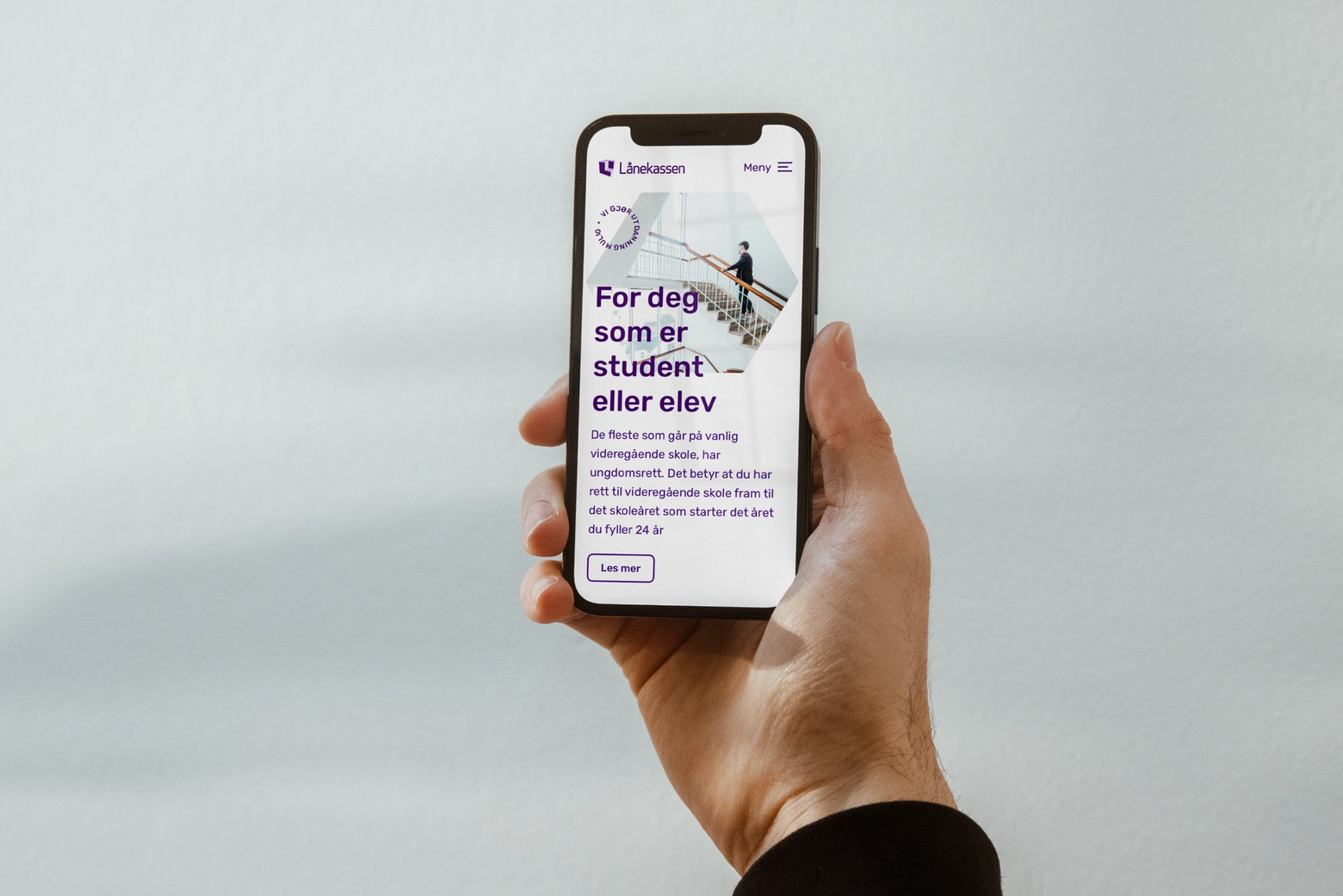
With a mission of making education possible to all, Lånekassen has been providing financial support, loans and grants to Norwegian citizens. Lånekassen approached NoA for re-designing their platform and digital experience of its users. Today, students and re payers have a fully digital dialogue with Lånekassen. However, that digital experience had a friction and was far away from its mission.
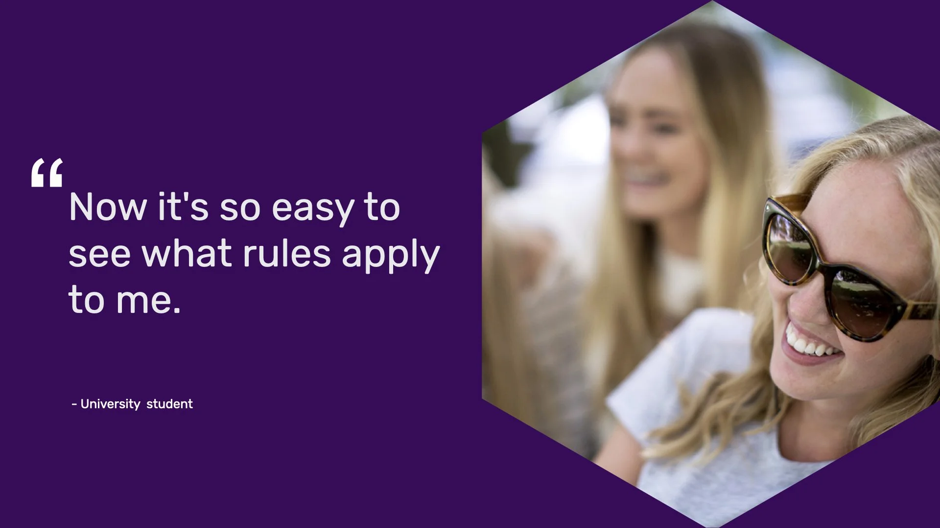
Together with team, we designed new solution creating cohesive experience for its different users. The vision was to builld more trust with between Lånekassen and its users. Also, altering how Lånekassen is perceived from passive government body to outgoing, action oriented.
Together with other designers, I developed strategies to address limitations of the previous solution, moving from heavy information to service oriented platform. We narrowed down to tactical steps in the platform. I drove initiatives to make sure that the experience felt consistent across all user groups ranging high school student to loan payer. Constantly, driving ways to make passive experience to more active one.
Weighing options
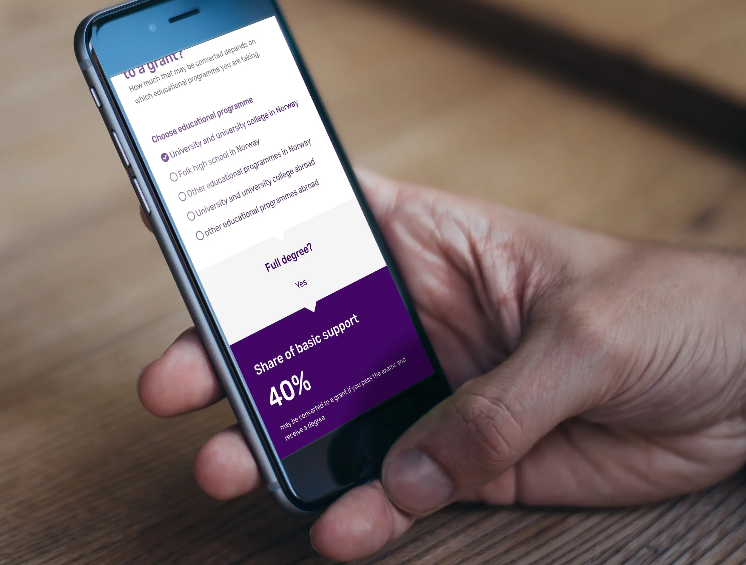
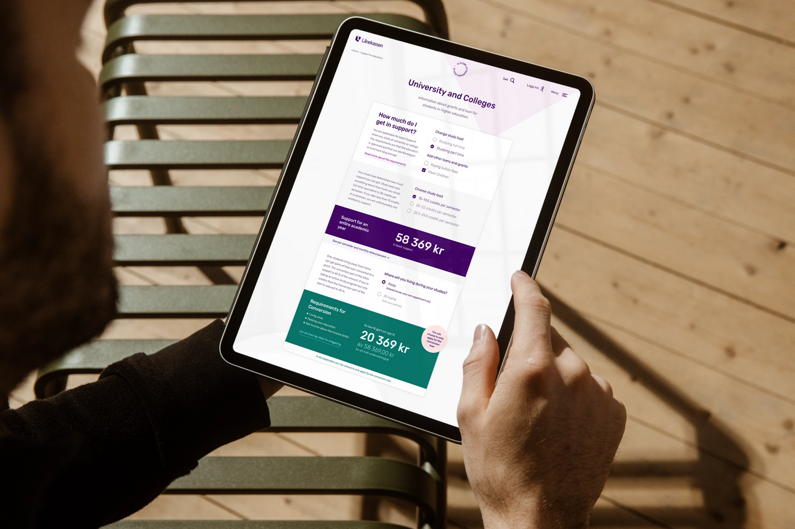
Rules and regulations are converted as choices to pick from in a playful manner. After making choices, based on who the user is or their situation contextualised content is provided. The most pressing information, like how they would be getting is presented at first glance.
Choosing with confidence
Ensuring that users get what they have a right to get. We wanted to them feel emboldened, and calm as they made one of the biggest decisions of their lives. They will have enough information to feel secure in next steps, ensuring that they apply at the right time. Deadlines, interest rate etc presented in badges to highlight it.
Creating a balance
Between being empathetic and providing them with cold harsh facts. By challenging previous tone of voice, interactions and information we ensured: They will know enough before applying about what is required of them and have a pretty good idea of what the end result should be.
The platform was launched in May 2020 and the initial data showed an increase of 30% in the overall conversion rate, with mobile increasing by almost 420%.
AWARDS
GULTAGGEN, 2021


